
Sofia Isabella knows what it takes to make the grade when it comes to make up. She’s currently a senior/lead artist at Charlotte Tilbury in London and has built up a reputation for delivering consistently flawless work. Devolution’s Gary Trueman teamed up with Sofia to discuss the finer points of colour coordination, something that can make or break a look be it for a photo shoot or simply a night out.

Thanks for chatting to Devolution Sofia. Let’s kick things off with a look at your make-up for the shoot you did with us….
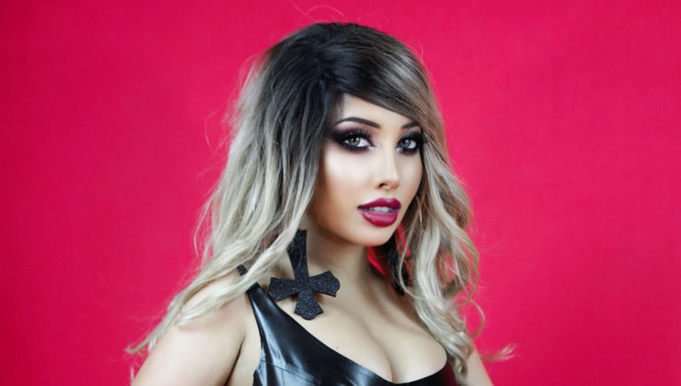
As a make-up artist you’ll work with colour palettes and colour coordination every day. So for instance the images of you shot for this feature use predominantly black and red. That’s a classic mix. Is black something that goes with any colour? Why do you think it’s so popular even as a stand alone when other colours aren’t used at all?
“I think everything goes with black, but I love the classic black outfit on red back drop its timeless! Its powerful even on its own, you just cant go wrong with it and always makes you stand out which is what I live for and what I do with makeup, always making things stand out.”
Do other colours work as a single entity or can some be a bit overpowering?
“I think the same hue can be over powering, I think different shades. You see this a lot in shoots with pink.”
How important is it to consider make-up and accessories for a photo shoot and to pre-plan how they’ll blend with the colour theme?
“It is really important to plan out your outfits beforehand depending on the mood board you have created. With each outfit you’ll know which backdrop you’ll want, and will coordinate the matching lipstick and eyeshadow so nothing stands out too much over the other. It is important to have a flow of continuity in an image otherwise it can be too distracting.”
With your make up for this shoot you’ve picked out a red shade lipstick along with dark tones for your eyes. Again this is a classic coupling. What eye product did you use (mascara, shadow, brushes, eyebrows) to get the effect you did. Did you do anything in the application process that people often don’t do that’s key to getting a great finish?
“A dark eye is always a must for me, but I always use a lighter colour in the corner of the eyes which opens them. To create a more feline eye I used my Feline Flick- (Charlotte Tilbury) from the bottom lash line towards the end of the eyebrow. If you create a liner too upwards it doesn’t give your eye a sultry look and doesn’t elongate them.
I used Fuchsia blusher – MAC as a transition colour before I added black, I find having a transition colour and not just using one colour stops the eyes looking flat, and gives a more gradual effect to a smokey eye.
- I used Legendary Lashes mascara- Charlotte Tilbury
- Carbon eyeshadow- MAC
- Feline Flick Panther- Charlotte Tilbury
- Waterproof pencil eyeliner- Armani
- Eyebrow- Brow Lift – Charlotte Tilbury – I shade above my brow rather than below which opens my eyes.
The brushes I use are blender and smudger brush from Charlotte Tilbury. A good tip to avoid fall out under the eye is to use your smudger under the lash line in one application straight across, if you try to shade the eyeshadow falls and makes your eye bags look worse.”
Any tips for getting those eyebrows to match out the start of my brow, middle and end.
“I use my eyes to map out my brows:
- Start – Place the end of your pencil from the inner corner of your eye and where it ends on the eyebrow is where you start the brow (add a dot as a guide to map it out ).
- Middle – Look straight ahead and where the pencil sits is where the middle of your brow should be, again add a mark to map this out, the end of the pencil should be sitting on your brown to add a mark.
- End – Place the end of your brow pencil on the out corner of your eye, and where the pencil ends is where the end of your brow should be! I add a mark with the pencil, so when I fill it in I know where to start and end my brows.”
Same for your lipstick. What product did you use and any common mistakes in applying?
“I used Savage Rose Lip Cheat Charlotte Tilbury and Slipper Orchid Retro Matte MAC. The trick is to get a crisp lip line, to do this you want to create small strokes around the lips, almost line a little then go back over which creates a good definition, the small strokes will make it neat and controlled too in comparison to doing big strokes and trying to shade around the lips. A lot of people over draw and forget to over draw the centre of the cupids bow, which creates a dip! Don’t forget to keep the lip line the same all around the lip.”
What foundation do you recommend and how important is it to pick the right match for your skin. When is the right time to really change things up shade and tone wise?
“I use MAC Studio Fix Fluid, with a primer as my skin is dry (Wonderglow by Charlotte Tilbury). It is important to have the foundation match the neck, otherwise you’ll have a line. The face has different colourings, so it won’t be a true match unless it is tested on the neck. If you want to be darker blend the foundation down the neck and powder lightly to set. It is important to have the right foundation that suits your skin type too, so it sits nicely. (If you are oily use matte and it won’t separate, if you are dry use dewy and your skin won’t look tight and flaky). I meet a lot of clients who change their foundation in the summer and winter. Gothic wise, I find they don’t tend to go darker or change their foundation, it is either matched or lighter for a paler look. I’m a tanned goth being Italian, so when I was younger making myself look pale was very obvious.”
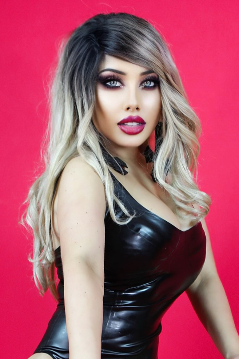
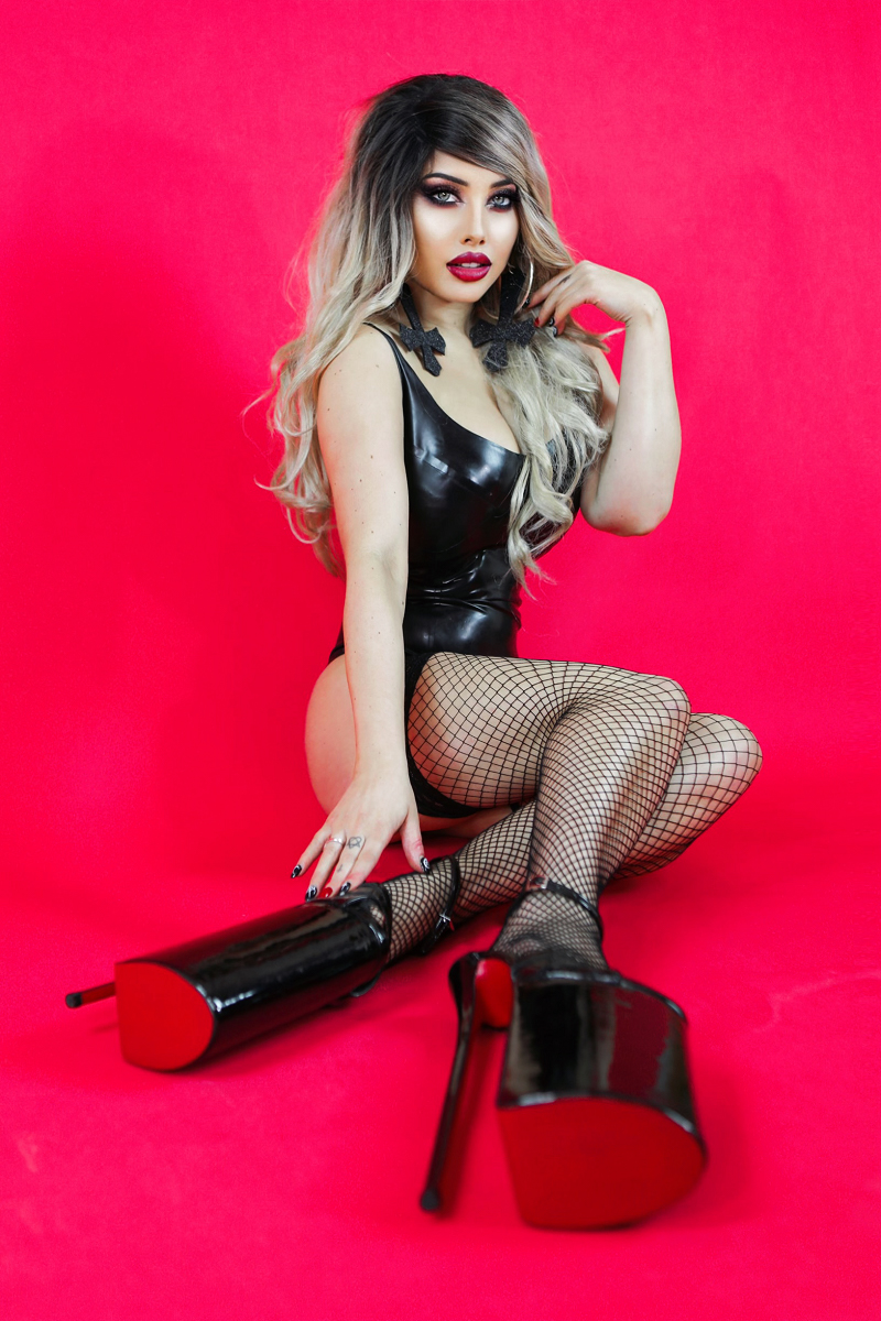
You’ve cleverly kept the theme running with your fingernails too with black detailed nails but also red for your middle fingers. That level of paying attention to every aspect really does pay off in the finished images. But it must work just as well for a night out too doesn’t it?
“I think it’s really important to take into account the finer detail, otherwise a mismatch will stand out. Luckily, I mostly wear black or red, so it works! If I were to wear a different colour for a shoot, I would have my nails painted the same colour.”
You shoes also matched the theme by being black or reflective which allowed for a mirroring effect. They looked amazing for this shoot but presumably something a little less stacked would work almost as well if you needed to do a lot of walking?
“I am always glad I don’t have to do modelling that requires walking, otherwise that’d be a different story ha ha. Usually for a shoot I’ll walk into my position without heels, then put them on leaning on the photographer!! These shoes for the shoot were freakishly high, not my normal height.”
With colour generally are there any combinations that you’d say simply don’t work at all? And how important is it to stick to a theme? For instance, the images we shot for this feature would have looked odd if you’d had blue lippy or green eye shadow, wouldn’t they?
“Blue and pink I find doesn’t work, and blue and green is harsh on the eyes and face! It depends how it is applied, if they are softer hues and not so bold you could just about get away with anything! But it also depends on the hair colour too.”
If you’re going to be doing make-up for a client is it important to know what they will be wearing and what occasion it’s for so you can give them the best possible look?
“It changes everything, as the client puts you in charge of the makeup completely to adapt to their outfit. It can really clash if the makeup does flow with the colours or cut of the outfit. The occasion is really important too, a wedding look would be different to a concert! The ladies I do makeup on don’t really have statement extreme makeup where maybe they have a signature look, they want always. It is more red carpet / glam where the outfit would come into account and they are open to all suggestions. In fact most say, I don’t want to have your heavy makeup ha ha!”
Do you find some styles coming into and going out of fashion? For instance, the bright blue and green eye shadows from the 70s.
“Greens have made a comeback, cut crease is really in fashion which replicates 60’s makeup from icons like Twiggy. The classic blue eyeliner has well and truly gone out of fashion, I catch my mom trying to do it from time to time.”
You’re a professional make-up artist and a model too. So are there any colours both clothes and make-up wise you really avoid like the plague for whatever reason?
“I hate bright red lipstick on me, I always go for deeper reds. I avoid most colours, I stick to red, black or pink.”
What advice would you give someone in terms of their make-up colour choice for an important occasion such as a night out or a photo shoot. (Any dos or don’ts)
DO’S:
- Coordinate your makeup with your outfit.
- Do you concealer well after your mascara to avoid any print under the eye.
- A classic mistake ladies come to me for is the contour, apply the bronzer above the cheek bone / top of the ear. Otherwise you’ll take your cheek bone downwards when you blend.
- Always use an eye primer, the eyelids get oily throughout the day and the makeup creases, or the mascara/ eyeliner will print. I use MAC 24hour eye base.
DONT’S:
- Avoid a bright bold lip with a dark eye.
- Avoid orange bronzers, try cooler tone bronzers to create definition on the face.
- I would recommend getting your partner to do your makeup and film it, now that’s entertaining!!”
For those wanting to learn makeup at home Sofia is available for Zoom appointments.
You can contact her at sofiaisabella@live.co.uk
Interview and photos by Gary Trueman